16.03.2021
In this article, we're going to introduce how easy it is to create custom-styled visualizations in Graphlytic. We'll describe general and simple ways to style visualized nodes and relationships based on elements' properties.
To introduce the styling options we'll start with our first visualization from scratch, with no preset stylings. We'll walk you through the initial visualization settings directly in a new visualization. We'll show you various styling options, such as shapes, sizes, colors, borders, and icons or images for graph elements.
We'll work with the IT network data set identical to our IT infrastructure Demo, so you can try all the styling options by yourself. If you need a better understanding of this topic, please read our previous post How to Visualize Your IT Network Infrastructure with Graphlytic. In that post, we presented the benefits and specific Graphlytic features for supporting the IT operations documentation, the general principles for building a data model for any relationships-based use case, as well as the setup of a prototype and production environment.
The prerequisite for this blogpost is to have the Graphlytic application up and running and connected to the Neo4j graph database. If you haven't done so yet, the easiest way for trying out Graphlytic is our Cloud offering. You can run the application in a few minutes.
From the ground up
As you can see in the following short clip, our first steps in a new visualization are these:
- We add one or a few nodes with the 'Search bar' in a header panel.
- We can use the 'Explore selected nodes' button to add neighbor nodes to the visualization. This enables us to see and check if the imported data set includes directed relationships, as expected.
- We may also use a specific layout, selecting one from 'Layout tools'. In this case, we used a 'Force-directed layout'. This type of layout is calculated by the gravity algorithm, so we get a new layout every time we click the button.
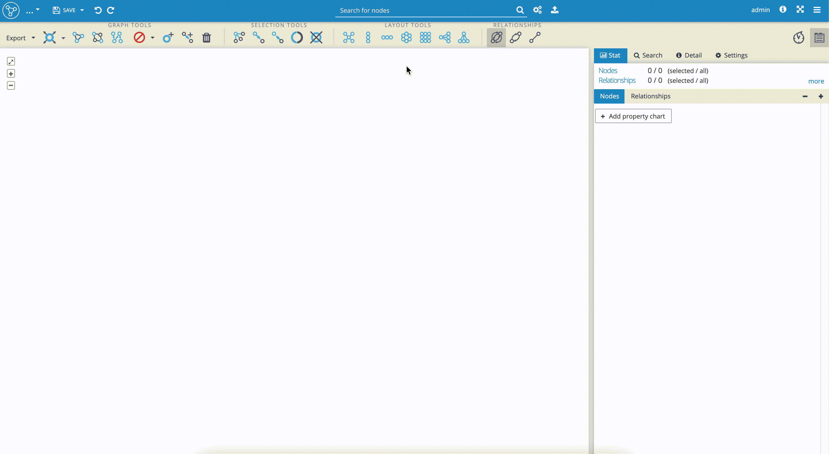
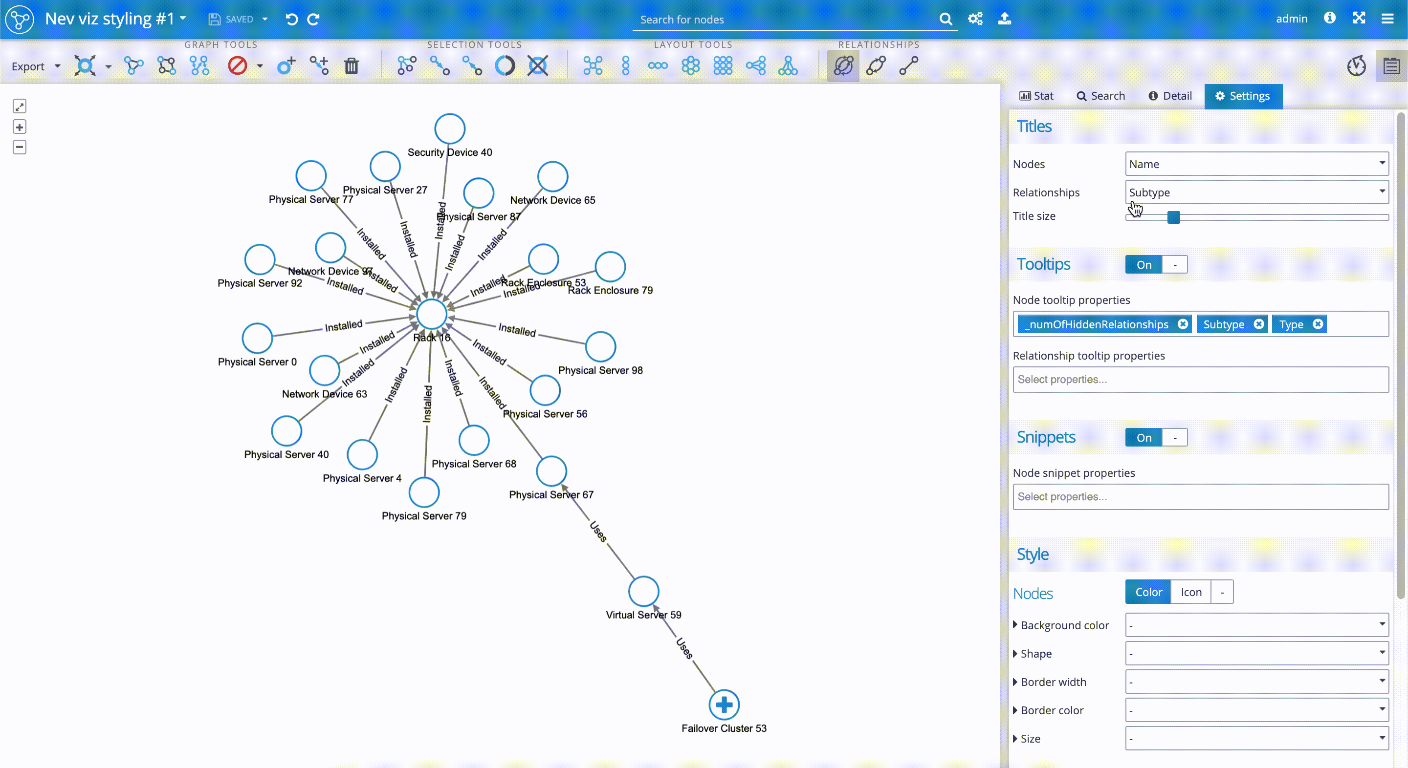
- We move on to the 'Control panel' on the right-hand side, with four tabs. Currently, there are no statistics available in the 'Stat' tab. We select the 'Settings' tab to start our visualization styling.
- In the 'Settings' tab, we decide first what 'Titles' are to be shown - which properties will define nodes and relationships in the visualization. We decided to select the 'Name' property for node titles, which identifies every single node from our data set. For the edges (relationships) we selected the 'Subtype' property, which in our data set has the values, such as 'Installed', 'Used', etc.
- 'Tooltips' are used to define what properties are to be displayed to the user when hovering with the mouse pointer over the specific node. In our case, it is really helpful to add the property '_numOfHiddenRelationships', which will show us how many relationships are hidden when the node is not fully explored. This property is particularly useful in the case of data sets containing nodes with thousands of relationships, where the graph rendering could take some time. As we can see in our visualization in the clip below, the 'Failover Cluster 53' has 38 hidden relationships. For the "Node tooltip properties", we added the 'Type' and 'Subtype' properties, which help us identify the categories of network devices.
Now, we scroll down the 'Settings' tab to move on to the user styling of nodes and edges in the 'Style' section.
Styling the elements - discrete and linear mapping rules
Every visualization styling is based on one of these two rules:
1. Discrete mapping
In discrete mapping, every property value can have a separate style value. This means we can set styling values separately for every element in our data set based on the properties we decide on. For example, we can determine what unique background or border color, shape, or icons we set to which property values.
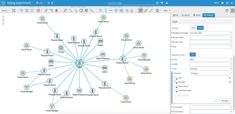
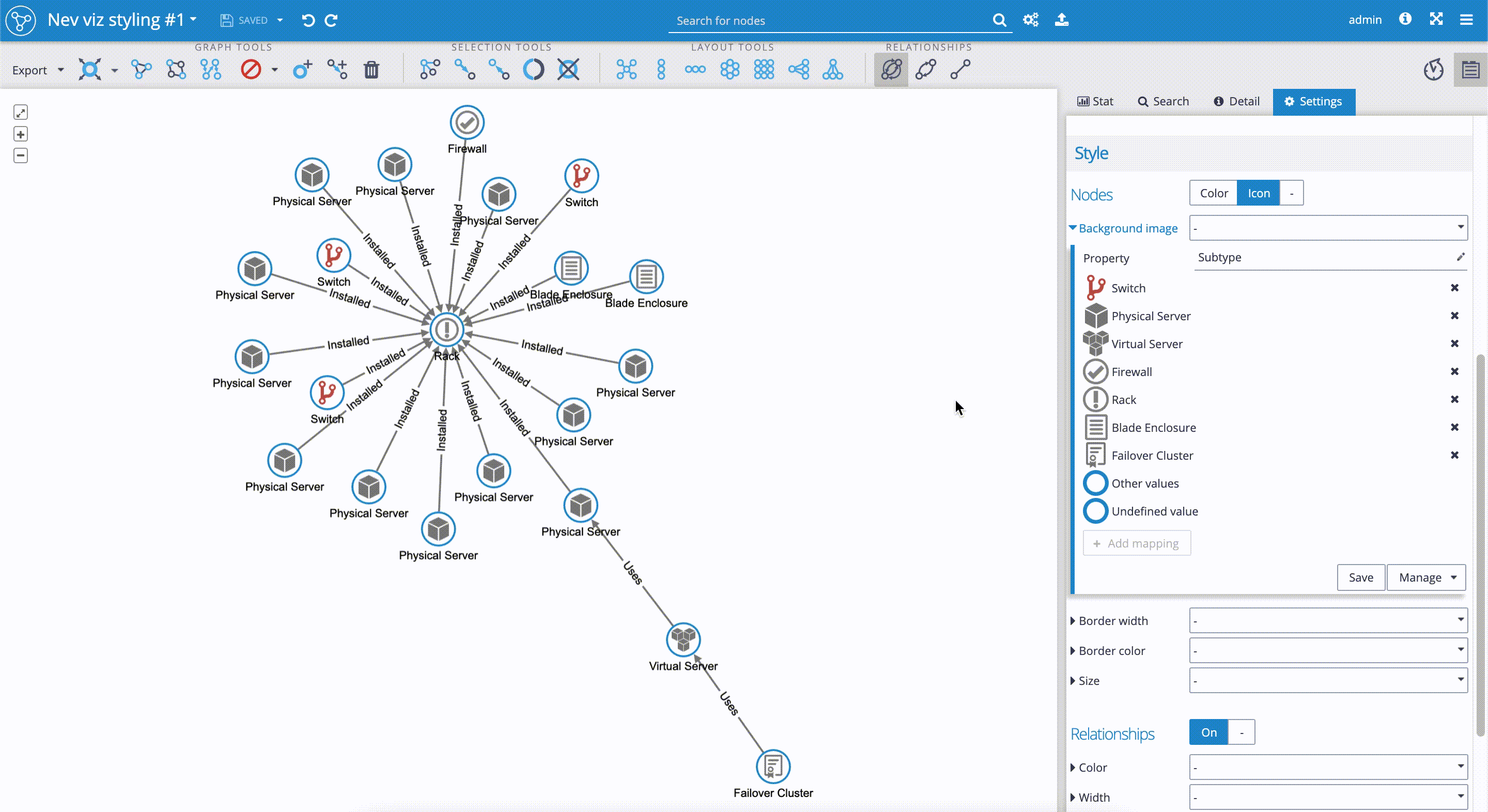
The following picture illustrates three discrete styling mappers used for our data set. See the 'Control panel' on the right-hand side, in the section 'Style'.
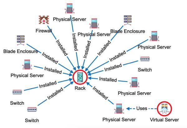
First, for the 'Nodes', we applied custom icons for the 'Background image'. As you can see, that based on the 'Subtype' property value, we assigned the unique custom icons to subgroups, such as 'Rack', 'Switch', 'Firewall', etc.
Later in the article, with the help of a short clip, we'll introduce how you can use built-in icons and how easily you can add your use-case-specific icons. You'll also learn how you can save your visualization style and how you can make your favorite styling mappers the default for all new visualizations done in the Graphlytic application.
For the 'Relationships,' we set two styling options - the 'Color' of the edges to be blue, and the 'Style' of the relationships to be dashed or full line depending on the 'Subtype' property of the relationship (full line for the property value 'Installed', dashed line for the property value 'Uses').
2. Linear mapping
Linear mapping is applicable specifically for those types of properties, that have countable values, i.e. the property values are set to specific numeric values for each graph element (node, relationship). In this case, the linear style mapping is based on the fact that minimal and maximal values are set, and the style values in between are calculated for every element, using interpolation. From the definition, linear mapping only fits when styling with:
- colors (background or border color for nodes, and color for relationship) - where styling values in the visualization represent changing colors (or hues, tints and shades);
- sizes and widths (size or border width for nodes, and width for relationships) - where styling values adjust the size or width to linear styling values between minimal and maximal size or width.
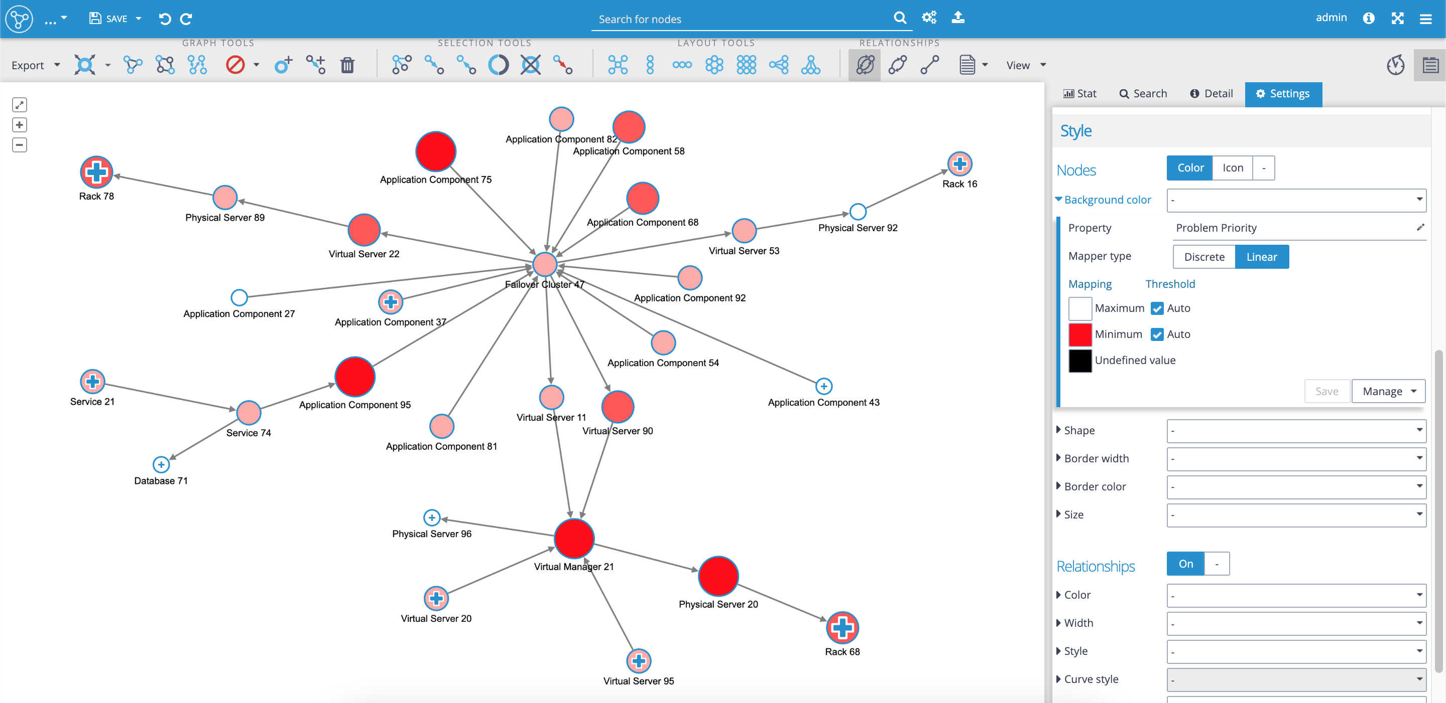
Linear mapping can be used for many data sets. For example, the data set containing financial values on nodes' properties allows us to apply the linear mapping style that could visually highlight exceeded financial thresholds, and be used as a dashboard.
In our use case, network devices (nodes) have the property called 'Problem priority' with values '1-Critical', '2-High', '3-Medium' and '4-Low'. It allows us to set a linear mapping style that reflects the severity of the problem. Probably the best idea would be to set-up a certain color-coding dashboard, with a red color for the 'Minimum', i.e. value '1-Critical' and white color for the 'Maximum'. We can combine various mappers in one visualization. We could also set up additional styling such as node sizing, dependent on the severity of the problem. The result is the visualization that highlights the most critical parts of the network as red and as the largest nodes:
Styling with custom icons, adding additional styling
In the following part, we'll continue with the styling of our data set. We'll learn:
- How to add our custom icons that suit our use-case the best and make our visualization unique.
- How to add additional styling to our visualization. In our case, we'll set the rule to highlight nodes with hidden relationships.
Styling of the visualization includes the following steps:
- First, we have to decide which node's property is the most suitable for styling with icons. We could have tons of properties on nodes in various use-cases. In our use-case, for example, where our data set contains hundreds of nodes with various properties, setting custom icons to the 'Name' property wouldn't be a good choice. We have to think about selecting one of the subgroups, such as 'Type', 'Subtype', 'Status', etc. In our case, we decide on the 'Subtype' property. Now it's good to change the 'Titles' of 'Nodes' in the visualization from 'Name' to 'Subtype', so we can check if new icons are applied correctly.
- We scroll down the 'Settings' tab again to the 'Style' section, where we select the 'Icon' sub-tab. We click on the 'Background image' and get the drill-down menu. In the 'Property' field we select 'Subtype'. We can see that the Graphlytic application automatically applies built-in icons to property values, that in our case represent subgroups, such as 'Rack', 'Physical server', etc.
- We can change the proposed icons by selecting ones from the existing pool of icons. It's really simple. We just have to click on the icon we wish to change. The drill-down menu with a pool of icons will appear. We select a new icon by clicking on it. In our case, we changed the 'Switch' icon.
- We can add our custom icons to the pool of icons. Graphlytic application supports jpg, png, and gif file types. For our use case, we purchased PNG icons from https://www.flaticon.com/. We just need to drag and drop the custom icons into the 'icons' panel on the Application Settings page. If you have any questions, please follow the documentation here.
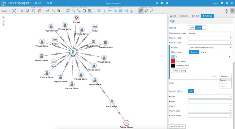
- When applying a new style mapper, such as we did for the 'Background image,' it's good to save the mapper by clicking on the 'Manage' button and then selecting the 'Save as' option. You can see the steps described in the following short clip:
The next step is to add the rule highlighting nodes with hidden relationships, i.e., nodes where neighbor nodes are not displayed yet. We've decided to visualize the nodes with the hidden relationships with a red border color. To do this, we follow the below-described steps and the attached print screen:
- In the 'Style' section, we select the "Border color". Click on the 'Property' menu and select the property '_numOfHiddenRelationships'.
- We select the 'Discrete' Mapper type. Graphlytic gives us suggestions for the color schema. If we want to change the color we want for the border of the nodes, we just click on the color square for the property value we wish to change. In our case, we select the light blue color for the borderline of nodes with no hidden relationships (i.e. zero value for the property), and the red color for values other than zero.
- Note: We might as well use the 'Linear' mapping for this property, as we can scale the color for values from zero hidden relationships up to the maximal value for the hidden relationships. In such a case, we can think of an example where the 'Minimum' value (zero hidden relationships) could have a white color, which will make the borders of nodes invisible due to the white background color of the canvas and the red color for the 'Maximum' value, which will make Graphlytic automatically calculate the shades between white and red color with the growing amount of hidden relationships. For this type of 'Linear' mapping, we just need to be aware that the color for the nodes is calculated every time we explore additional nodes.
- When done, it's worth saving the mapper again by clicking on the 'Manage' button, then selecting the 'Save as' option:
These were the basic principles of visualization styling. We've added a handful of examples to show how easy it is to set up your unique custom visualizations.
We encourage you to try your own stylings in our IT infrastructure Demo. If you wish to work with your own data set, please see our Graphlytic Cloud offering for a quick start.