
I'm excited to share that we've just rolled out Graphlytic 5.0, a new major version of our web app for graph exploration and analysis. With this release comes a new logo and primary color of the application, which is fully configurable to better blend with any organization's existing environment.
There are a lot of new features and improvements that can't be covered in a single blog post. Please read the Release notes for a list of all changes. The main areas of improvement are:
Now, let's take a look at the improvements in graph exploration.
In the previous releases, we have experimented with a context menu in the visualization. We have decided to greatly improve it with a completely new implementation. All graph actions are available in a simple form, just one right-click away. All existing actions like layouts, selections, alignments, expansion, and collapse of elements are included in the menu.
Expand menu
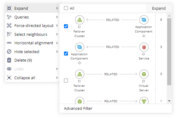
Expanding nodes in the visualization has never been easier and more flexible. Select the nodes you want to expand and then open the Expand menu. Choose what type of neighboring nodes you want to add, or use the advanced filter to filter down the result with property conditions.
Queries menu
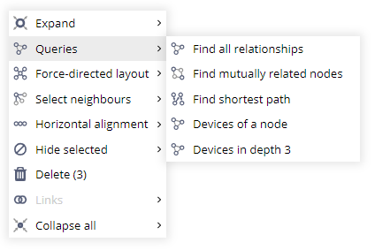
In the Queries menu, you can find all the common graph queries, such as Find all relationships, Find mutually related nodes, or Find shortest path. Next in the list are Query Templates defined on the Queries page that meet these criteria:
Having customized queries available in the context menu makes the graph exploration faster and more flexible. You can run the same query with a different starting point with just a few clicks.
For more info about Query Templates, refer to our documentation about Queries in Graphlytic.
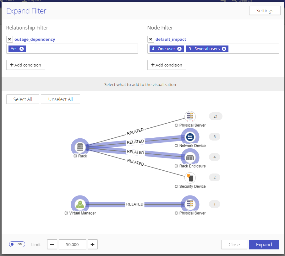
Exploring large graphs, especially highly connected graphs, can easily lead to a cluttered visualization with many nodes and relationships. This can be prevented with the Expand filter with property conditions. Before any nodes or relationships are loaded into the visualization, you can quickly check the visual summary of what will be added, use property conditions to filter down the result set and pick which groups will finally be added.
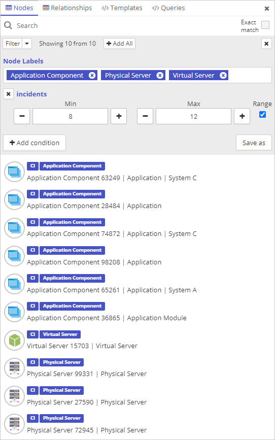
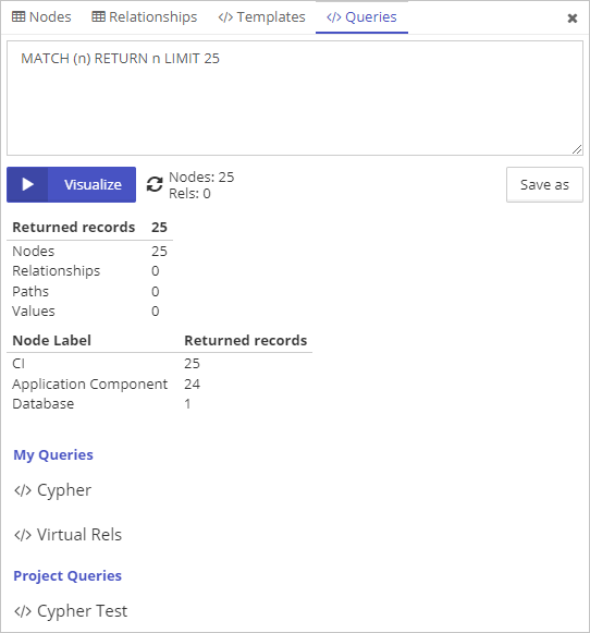
We have completely redesigned the Graph Search panel in the visualization. We have focused on adding more flexibility to the user with filters, the option to save created filters and queries, and expanded the search options to match most of the features available on the Queries page.
The tabs "Nodes" and "Relationships" are focused on fulltext search with advanced conditions that allow you to find precisely what you are looking for. Created filtering conditions can be saved for later use with the "Save as" button.
Custom queries and query templates have been separated into separate tabs designed to maximize the user's value. Custom queries can be created, saved, and deleted directly in the "Queries" tab, making it an excellent playground for more technical people.
Explore the potential of Graphlytic 5.0 in our online demo, or create a cloud instance in a few minutes.
Contact us, and we will help you get started. Join the graph side!
Michal
CEO